The long-anticipated fall of the systematic review
 You may have noticed that for a blog that is called “Evidence-Based Fitness”, that there is not one single mention or reference to the “Hierarchy of Evidence” pyramid. This is entirely intentional. I can’t count the number of blog drafts that I’ve tried to write and then scrapped on how much I hated the old “hierarchy of evidence”. But this week, the Evidence-Based Medicine “pyramid” has finally been reworked. It’s not as graphically pretty. It does, however, better reflect the reality of the “this is not actually how it works” pyramid of old. The new infographic was revealed and can be found here (it’s even open access!) So what does this new infographic mean?
In a nutshell, it means there are no more simple answers and no more simple classifications. It means you can’t skip steps. It hopefully means an end to the blind application of a clearly dysfunctional classification system to interpret and compare studies to one another.
Most importantly, it means that systematic reviews will have to be evaluated outside of the hierarchy on their own merits, as opposed to being placed on the top of the “hierarchy” by default purely because of the study design.
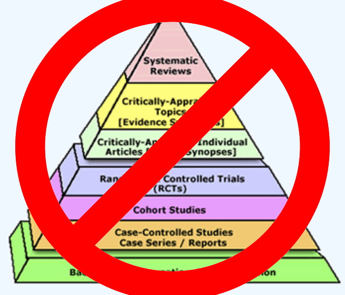
The old pyramid:
The old pyramid infographic was a way to make evidence-based appraisal more accessible. It made things look simpler and well-defined. But, in my opinion, it is precisely this accessibility movement that been the downfall of many attempts to implement evidence-based decision-making because it allows practitioners to skip steps.
First off, the old pyramid did not actually reflect the actual GRADE system whereby studies could be (and should have been) upgraded or downgraded based on critical flaws or merits, or within the context of the field of study in general. It represented a clear delineation of classification which put randomized trials near the top, which meant that for most blind applications of the pyramid, that no case-control study or cohort study could be more “important” than a randomized trial no matter how good or bad the specific study. This has caused no end of problems, particularly in large reviews and in guideline/consensus/policy formation as it meant that poor randomized controlled trials were often considered “better” evidence on which to base recommendations/policy when higher quality non-randomized controlled trials might have contradicted the findings of an RCT.
It also ignored the inherent problems that are present in all systematic reviews; which boils down to the “garbage in, garbage out” problem. A collection of poor studies, reviewed systematically, still yields a poor conclusion, no matter how you pool or manipulate the data. Now, if only we could fix the problem inherent in “automated” quality of trial scales…
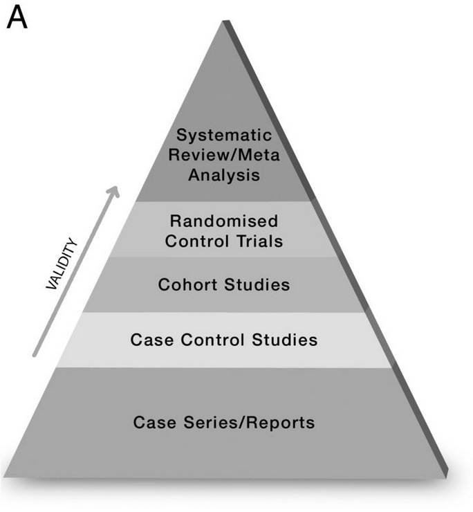
The new pyramid:
 The only I wish they had done with the new “pyramid” is to have made the wavy lines even deeper. In the right context, even a case-series can be stronger evidence than a poorly executed/designed randomized controlled trial. But I guess if they had made the waves deeper, the text would have looked super unreadable.
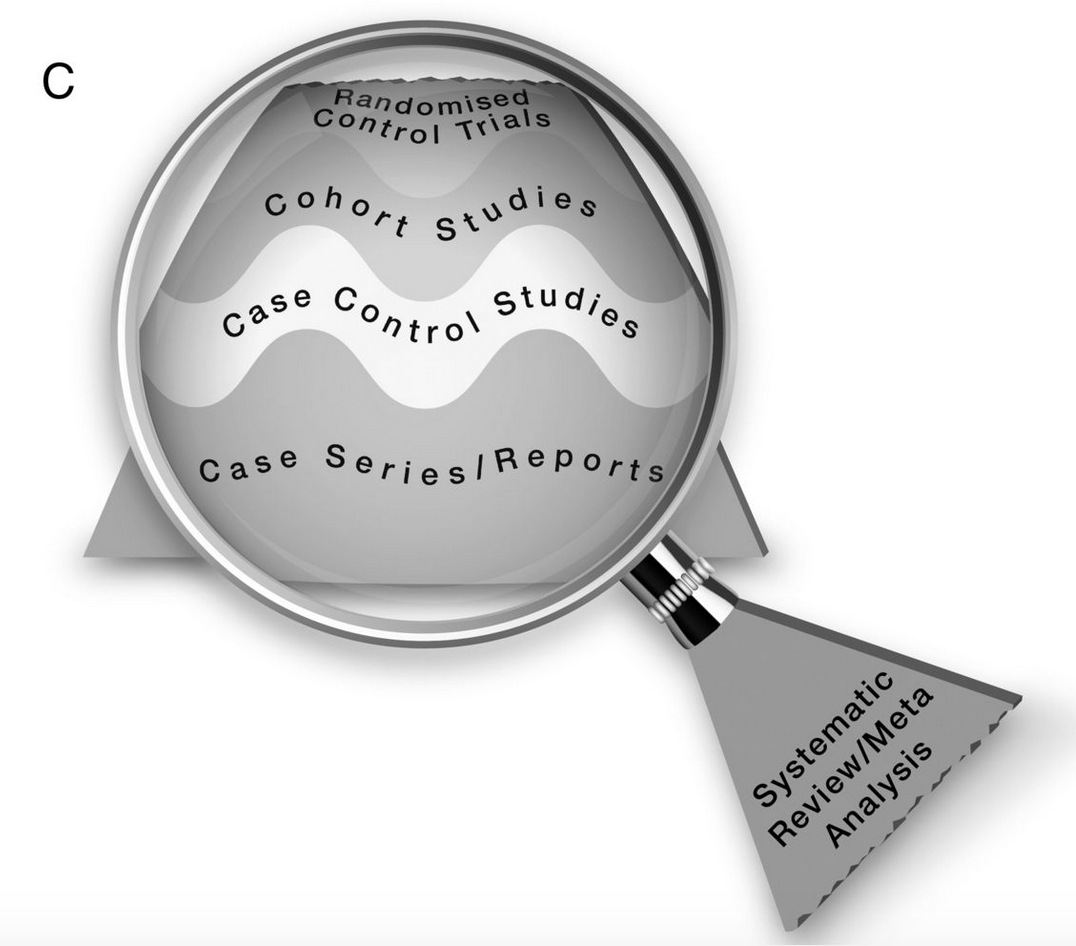
The part that I absolutely can get behind on the new infographic is the new placement of the systematic review as a lens through which evidence is viewed. This accurately removes the map-imposed monarchy of the systematic review as the highest level of evidence. It means that systematic reviews also have varying quality and are not automatically the go-to papers on which to base decisions. It also accurately reflects the reality that different lenses can cause different conclusions, a limitation of systematic reviews that has been highlighted in several more recent studies with multiple groups of investigators looking at the exact same systematic review data and coming up with wildly different conclusions from one another.
Critical appraisal is a skill that requires development, not a cookie-cutter recipe approach. The complexity of this skill is better reflected in the new infographic. I, for one, welcome the new infographic overlord. It’s not perfect, but it’s definitely less imperfect than before.
Now go revise all of your slides.